ShopDreamUp AI ArtDreamUp
Deviation Actions


Comments10
Join the community to add your comment. Already a deviant? Log In
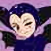
So much lovely to look at! Great pose, posture, coloring, palette, shading, and anatomy. So, what's left? Hmmm -- lets see -- little stuff, I guess!
Little stuff I like:
Anatomy -- Just great! You've got the illiac crest for the hips distinct from the thigh both in outline and abdomen accent. This is an easy one to miss or ignore, and it's a gentle touch that adds to the character. The collarbone wing is just enough in your style to be neither distracting or overdone. It adds depth and realism. And, lovely eyes.
Shading -- Good stuff. Very gentle and realistic on the body, breasts, and arms with just some touches of highlight. You've got shadow and depth to a simple but well colored background that accents the character without being distracting. Your hair styling is simple but effective.
Pose -- Great. Leaning but not sitting, and implies the weight/balance very well according to representative anatomy.
Little stuff I don't like:
Lighting -- Where is the light coming from? Two lights? Trying to follow the shadow/highlight shows at least two sources. Shoulders are different sources, right side arm from the right, but thigh shadow from the left.
Shadowing -- Gentle shading on the body, but more severe under the hair (over the shoulder). Did you sort out your hair scheme before or after lighting? Don't mind gentle shadows, just be consistent according to pose.
Breasts -- Size, structure, and repose are different between them. From above, the breast/nipple line to the backbone tends to be a 90 degree angle, so when viewing one straight on, the other will be mostly profile. This makes the far side breast look like the nipple is rotated toward the viewer somehow.
Armpits -- Kudos for drawing the pectoral hollow into the armpit connecting the breast (tends to be an R shape -- which you did) but the bicep edge needs to meet up with it. As drawn her underarm is way down the rib cage.
Face -- Implied nose and mouth, OK, but nose seems a bit far left. Your far side eye positioning implies a nose bridge which fits with the nose tip position, but now the mouth is shifted way to the right. Possible solution: move the chin tip to the left to re-center the 3/4 face view. The skull median line between the eyes doesn't match the mouth/chin location very well.
Pubes -- Stylized hair, so OK for stylized pubes. As shown, they'd be better as a fan than parallel diagonals.
Gray Basin -- If the thing she's sitting on is a vertical cylinder, the far left interior shadow line is weird. If the object is tilted, the the water line comes up to exactly the front edge, compared to the freeboard of the back edge. Trivia, but a style note.
Overall -- Just some tidbits to tweak. Fine work and applause, applause!